
Colour grading
Colour Harmony in Retouching: How I Pick a Palette With the Colour Wheel
A good colour grade is not a filter. It is a decision. Before I touch a curve, I pick two or three colours that belong together, and every adjustment after that pushes the image towards them. Here is how I use the colour wheel to make that decision, with real before and afters from my work.
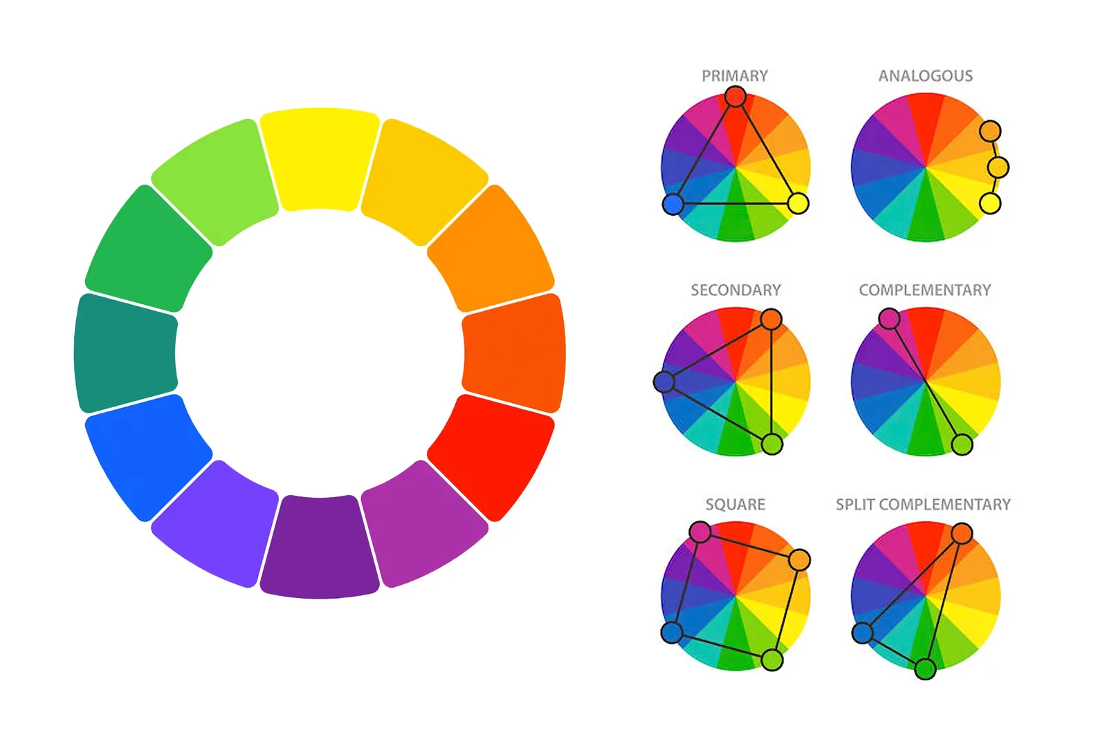
The six harmonies, in one minute
- Primary (triadic): three colours evenly spaced on the wheel. Bold and playful, best for creative or fashion work.
- Analogous: neighbours on the wheel, like orange, amber and yellow. Calm and natural. Great for skin and golden-hour light.
- Secondary: orange, green and violet. Rich and a little unusual, good for editorial looks.
- Complementary: two opposite colours, like teal and red or blue and orange. The strongest contrast, and the reason so many film posters look the way they do.
- Square (tetradic): four colours spaced evenly. Very lively, so one colour has to lead and the rest support.
- Split complementary: one colour plus the two neighbours of its opposite. All the contrast of complementary, but softer and easier to balance.
My rule: skin (or the product) is always the anchor. I choose the harmony around the skin tone first, then shape the background, shadows and clothing to fit it, never the other way round.
1. Complementary: teal against red lips
COMPLEMENTARYThe original was shot on a flat black background with plum-coloured lips. Nothing was wrong, but nothing pulled the eye either. I moved the lips from plum to a true red and built a deep teal into the background. Teal sits opposite red on the wheel, so the lips now jump forward without any extra saturation on the skin.
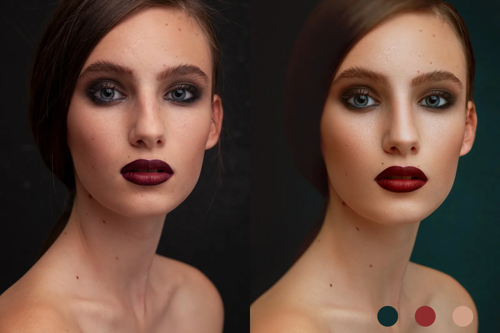
Notice what did not change: the freckles, the moles and the small scar on the forehead are all still there. A colour grade should change the mood, not the person.
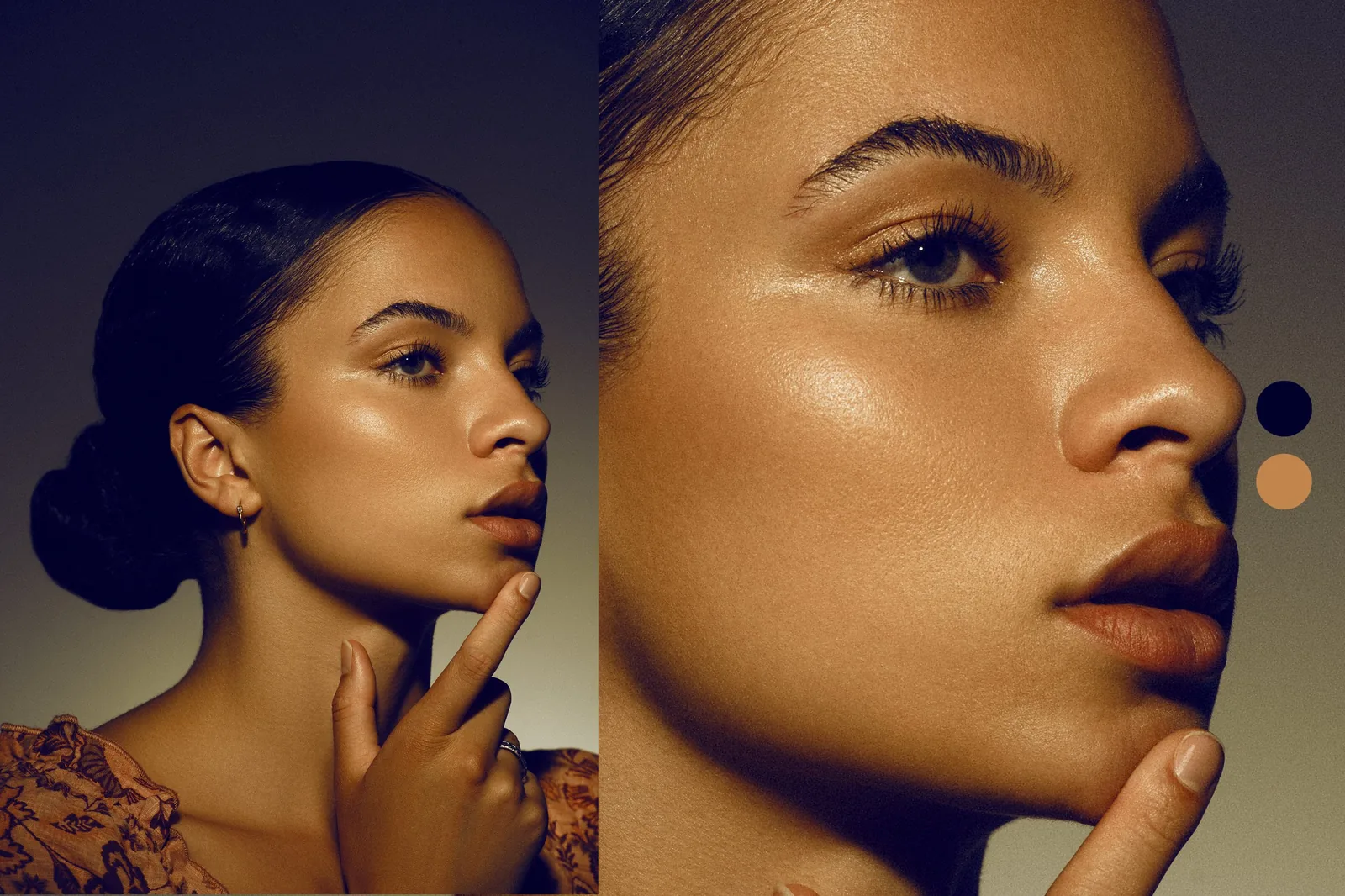
2. Blue and orange: warm skin, cool shadows
COMPLEMENTARYBlue and orange is the most useful pair in portrait retouching, because almost every skin tone sits in the orange part of the wheel. Here I pushed the shadows and background towards a deep navy and kept the skin in warm bronze. The highlight on the cheekbone stays clean and golden, and the face feels lit from within.
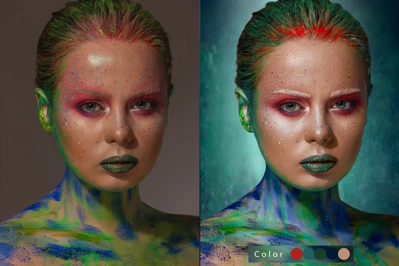
3. Square: a creative makeup look
SQUARECreative makeup already brings a lot of colour: red, green, blue and glitter. The grey studio background was fighting it. I replaced it with a textured teal that sits between the green and blue in the makeup, brightened the red at the hairline and cleaned the skin around the paint. With a square harmony, one colour has to lead, so I let teal take the background and kept red as the accent.
4. Split complementary: from magenta to smoke green
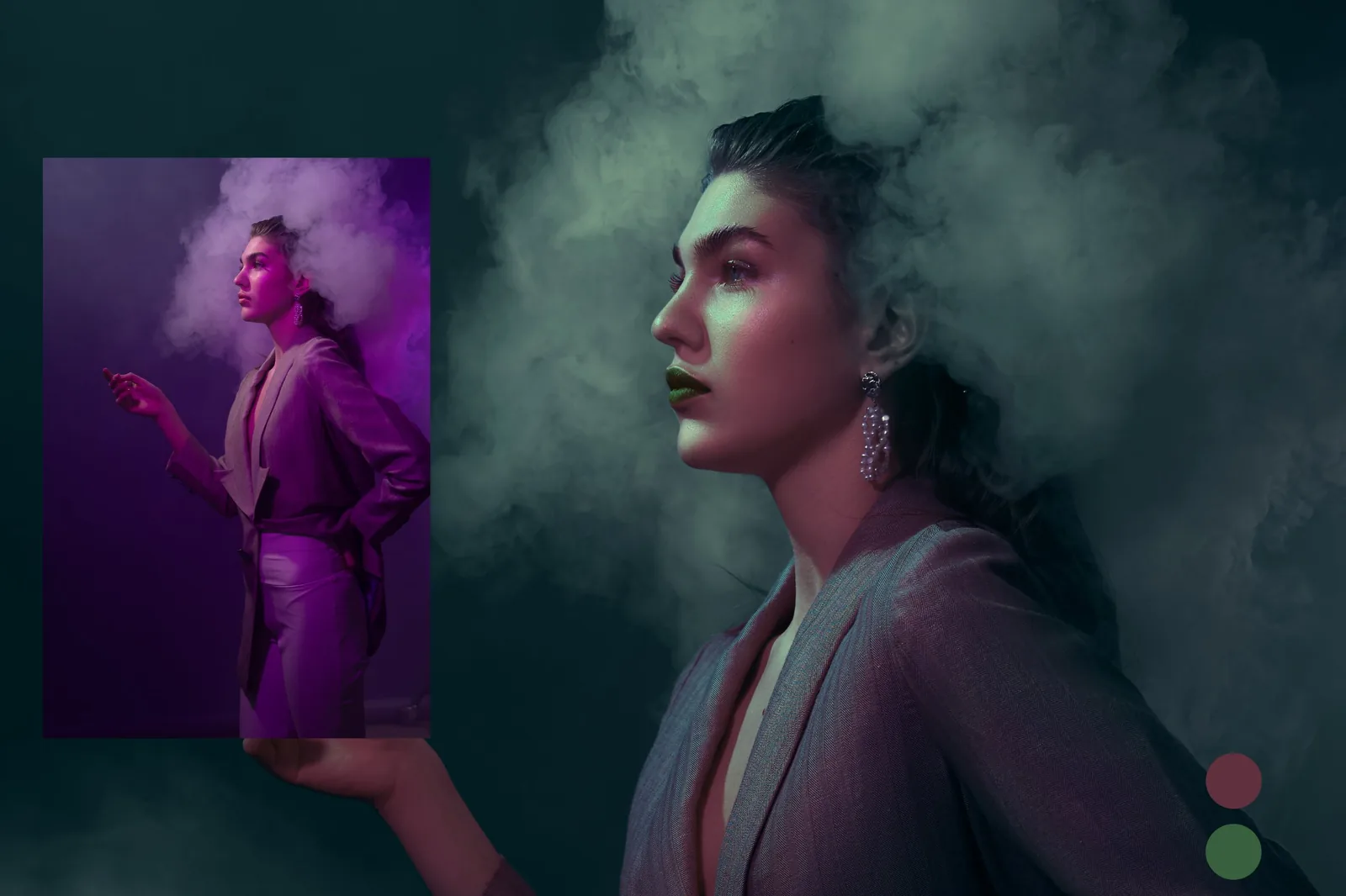
SPLIT COMPLEMENTARYThe original was lit with strong magenta gels. It was striking, but the skin had gone purple. I regraded the smoke and background into a muted green-teal and kept a soft mauve in the jacket and lips. Mauve with green and teal is a split complementary set, so it still has contrast, but it feels calm and cinematic instead of loud.
5. Two colours only: the iridescent veil
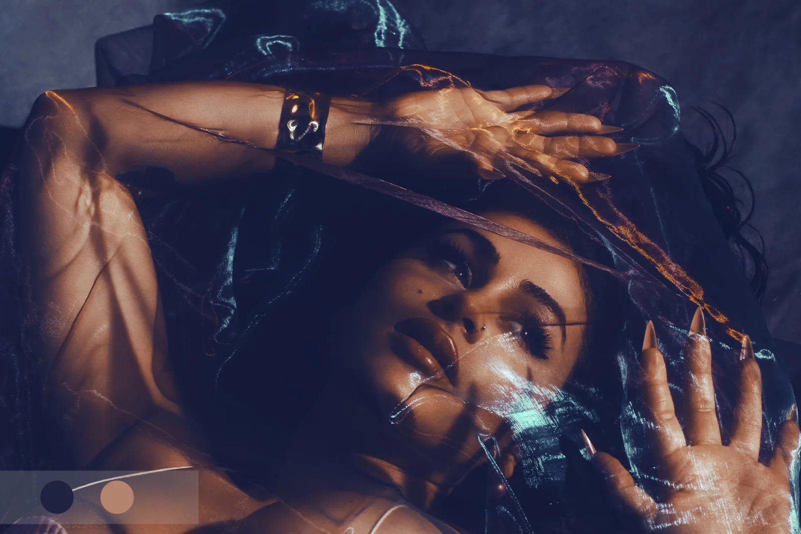
LIMITED PALETTESometimes the best harmony is the smallest one. The iridescent fabric throws off every colour in the rainbow, so I held the whole image to just two: a dark indigo and a soft peach for the skin. The fabric keeps its shimmer, but nothing distracts from the face.
6. It works on more than people
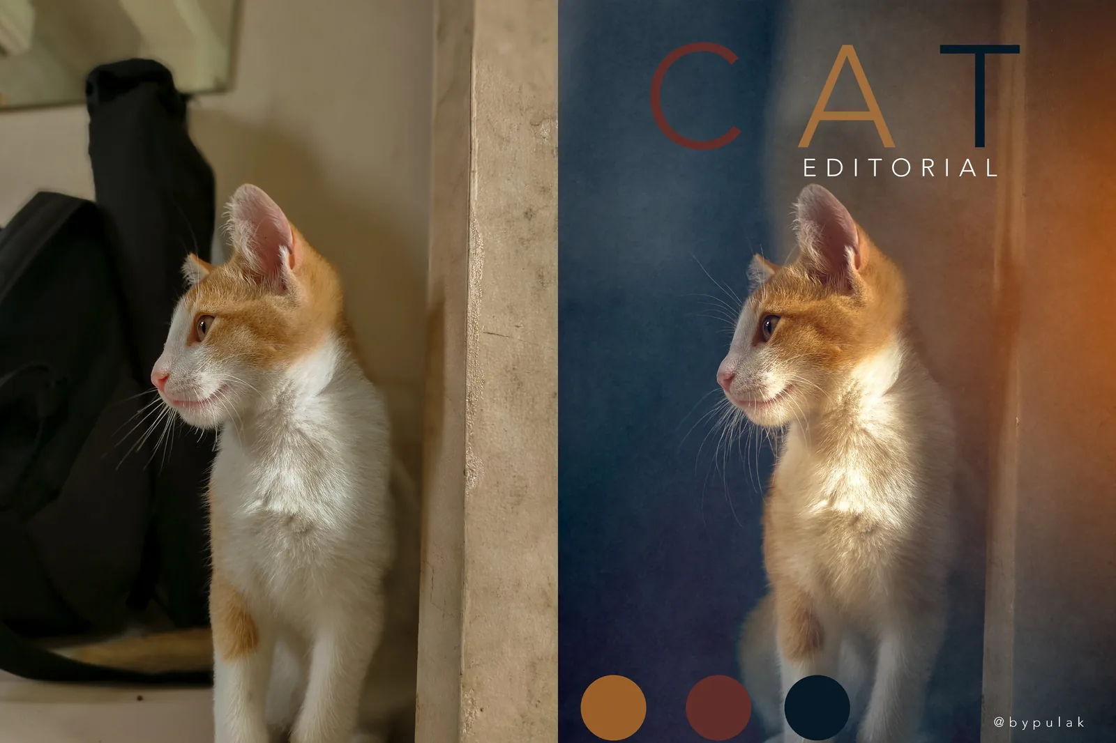
COMPLEMENTARY + ACCENTThis kitten was photographed on a cluttered floor next to a black bag. I removed the clutter, built a soft navy wall behind him and let a warm light fall from the right. Orange fur against navy is the same blue-orange pair as the beauty profile, with a deep rust used as a third, quieter colour.
How I apply a harmony in Photoshop
- Finish the clean-up first. Skin, stray hairs and distractions are fixed before any colour work, so the grade does not have to be redone.
- Pick the anchor colour. Usually the skin tone, or the product colour for e-commerce.
- Choose the harmony. I find the anchor on the wheel and decide which pattern suits the mood of the shoot.
- Move the background and shadows, not the skin. Curves, Colour Balance and Selective Colour, masked away from the face, do most of the work.
- Protect the skin. I check skin tones with the Info panel so they stay natural and consistent across the whole set.
- Sample the palette. I pick three to five colours from the finished image. If they do not look like a set, the grade is not finished.
- Final quality check. Every image is checked at 100% on a calibrated screen before delivery.
Want this look on your photos?
Send one image for a free test edit. You get it back within a day, with unlimited revisions.
Get a free test editSee the portfolio